Read the Fine Print
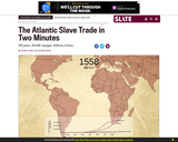
This interactive gives students a sense of the scale of the trans-Atlantic slave trade across time, as well as the flow of transport and eventual destinations. The dots which represent individual slave ships also correspond to the size of each voyage. The larger the dot, the more enslaved people on board. The interactive animates more than 20,000 voyages cataloged in the Trans-Atlantic Slave Trade Database. The graph at the bottom accumulates statistics based on the raw data used in the interactive and, again, only represents a portion of the actual slave trade - about one-half of the number of enslaved Africans who actually were transported away from the continent.
- Subject:
- Social Studies
- Material Type:
- Interactive
- Provider:
- Slate
- Date Added:
- 04/27/2017