Students draw a smooth curve that could be used as a model …
Students draw a smooth curve that could be used as a model for a given data distribution. Students recognize when it is reasonable and when it is not reasonable to use a normal curve as a model for a given data distribution.
This task was developed by high school and postsecondary mathematics and health …
This task was developed by high school and postsecondary mathematics and health sciences educators, and validated by content experts in the Common Core State Standards in mathematics and the National Career Clusters Knowledge & Skills Statements. It was developed with the purpose of demonstrating how the Common Core and CTE Knowledge & Skills Statements can be integrated into classroom learning - and to provide classroom teachers with a truly authentic task for either mathematics or CTE courses.
In this lesson, students will analyze and explore the data collected in …
In this lesson, students will analyze and explore the data collected in the cell phone experiment. Graphs such as boxplots and comparative boxplots are drawn to illustrate the data. Measures of center (median, mean) and spread (range, Interquartile Range (IQR)) are computed. Outlier checks are performed. The distinction between independent samples and paired (matched) samples is discussed. Conclusions are drawn based upon the data analysis in the context of question(s) asked. An extension to a randomization test (permutation test) is discussed.
Students will analyze a variety of county-level census data, including on employment, …
Students will analyze a variety of county-level census data, including on employment, technology, and transportation, in histograms to compare and contrast the shapes of their distributions and to interpret measures of center and spread in context.
In this Khan Academy activity, students will represent data with plots, interpret …
In this Khan Academy activity, students will represent data with plots, interpret differences in shape, center, and spread in the context of the data sets, and examine the effects of extreme data points (outliers) on shape, center, and/or spread.
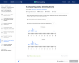
Students compare two or more distributions in terms of center, variability, and …
Students compare two or more distributions in terms of center, variability, and shape; Students interpret a measure of center as a typical value; Students interpret the IQR as a description of the variability of the data; Students answer questions that address differences and similarities for two or more distributions.
Students are already familiar with dot plots, box plots, and histograms. This …
Students are already familiar with dot plots, box plots, and histograms. This task has them describe data distributions and compare shape, center, and spread of two or more sets of data.
Students will use data on the organization, spending, and populations of governments …
Students will use data on the organization, spending, and populations of governments at different levels (city or town, county, and state) to compare and contrast the distributions of these variables in graphs, analyzing the shape, center, and spread of each.
Students construct a dot plot from a data set; Students calculate the …
Students construct a dot plot from a data set; Students calculate the mean of a data set and the median of a data set; Students observe and describe that measures of center (mean and median) are nearly the same for distributions that are nearly symmetrical; Students observe and explain why the mean and median are different for distributions that are skewed; Students select the mean as an appropriate description of center for a symmetrical distribution and the median as a better description of center for a distribution that is skewed.
Students will develop a set of tools for understanding and interpreting variability …
Students will develop a set of tools for understanding and interpreting variability in data, and begin to make more informed decisions from data. They work with data distributions of various shapes, centers, and spreads. Students build on their experience with bivariate quantitative data from Grade 8. This module sets the stage for more extensive work with sampling and inference in later grades.
Students will interpret box plots that represent the national median earnings of …
Students will interpret box plots that represent the national median earnings of men and women aged 25 and older whose highest levels of educational attainment are either a high school diploma (or equivalent) or a bachelor's degree. Students will use the box plots to identify each data set's median, maximum, minimum, first quartile, third quartile, range, interquartile range, and outliers. They will also compare the box plots to draw conclusions about differences in earnings between the sexes and between levels of educational attainment.
This lesson looks back at the graphs students previously studied as an …
This lesson looks back at the graphs students previously studied as an introduction to this module. Students are also asked to interpret what a graph communicates. They are reminded that a graph is not only a representation of data but also a summary of a data story. Each of the graphs presented in the exercises are encountered in the lessons that follow in this module. This lesson asks students to start thinking about what the data indicate, how they might have been collected, and what they tell us.
Students estimate the mean and median of a distribution represented by a …
Students estimate the mean and median of a distribution represented by a dot plot or a histogram. Students indicate that the mean is a reasonable description of a typical value for a distribution that is symmetrical, but the median is a better description of a typical value for a distribution that is skewed. Students interpret the mean as a balance point of a distribution. Students indicate that for a distribution in which neither the mean nor the median is a good description of a typical value, the mean still provides a description of the center of a distribution in terms of the balance point.
Students will create and compare dot and box plots that show the …
Students will create and compare dot and box plots that show the percentages of single mother and single-father households in different regions of the United States.
Students use a statistics calculator to compute the mean and the standard …
Students use a statistics calculator to compute the mean and the standard deviation of a data set and compare the variability of data sets. Additionally, students continue to refine their knowledge of standard deviation and how it measures a typical deviation from the mean.
In this lesson, students describe data distributions in terms of shape, center, …
In this lesson, students describe data distributions in terms of shape, center, and variability. Students use the mean and standard deviation to describe center and variability for a data distribution that is approximately symmetric.
Math 1 Statistics Project to assess students' knowledge of basic statistical information, …
Math 1 Statistics Project to assess students' knowledge of basic statistical information, and how to analyze their data. Students will be asking 20 students (or more if so desired by teacher) a question of their choice from a provided list. Students will then use their data to find mean, median, mode, range, and outliers; create a histogram and a box and whisker plot; and analyze their data by answering reflection questions. This project can be used as a final assessment for a Math 1 statistics unit.
Math 1 Statistics Project to assess students' knowledge of basic statistical information, …
Math 1 Statistics Project to assess students' knowledge of basic statistical information, and how to analyze their data. Students will be asking 20 students (or more if so desired by teacher) a question of their choice from a provided list. Students will then use their data to find mean, median, mode, range, and outliers; create a histogram and a box and whisker plot; and analyze their data by answering reflection questions. This project can bse used as a final test grade for a Math 1 statistics unit.
No restrictions on your remixing, redistributing, or making derivative works. Give credit to the author, as required.
Your remixing, redistributing, or making derivatives works comes with some restrictions, including how it is shared.
Your redistributing comes with some restrictions. Do not remix or make derivative works.
Most restrictive license type. Prohibits most uses, sharing, and any changes.
Copyrighted materials, available under Fair Use and the TEACH Act for US-based educators, or other custom arrangements. Go to the resource provider to see their individual restrictions.